
PTE Describe Image free Practice material– Look at the Pie chart below. You will have 40 seconds to give your response. You should describe the image in a logical manner. Strategy to describe the image given below– Start with an introduction, followed by the main body, and end with a conclusion.
Related Links-
Describe Image Practice with Sample Answer 7 (line graph)
Describe Image (Bar Graph) With Answer 8
#1 Describe the image (Pie Chart) given below-

The pie chart illustrates the overall job satisfaction.
It is clearly visible that people who are somewhat satisfied and very satisfied have claimed around 47 percent of the total. While people who are somewhat dissatisfied and indifferent claims the same number of percentage chart that is 6%. In end, only 2% percent who are working are very dissatisfied.
To conclude, most of the people are satisfied with their jobs.
#2 Describe the image (Pie Chart) given below-
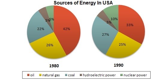
The pie charts show the distribution of different sources of energy from the year 1980 to 1990 in the USA.
From the year 1980 to 1990, the major source of energy for the USA is oil which has 42 percent and 33 percent of total respectively. The other source from where the USA gets energy is the natural gas which has decreased from 26% to 25% in the year 1990. The use of coal for energy has shown an increase of 5% in the year 1990 from its use in the year 1980 where it was only 22%. The use of hydroelectric power remains same in years but nuclear power has shown growth in a decade.