PTE Academic Speaking Describe Image practice examples – Look at the Pie Chart below. In 25 seconds, please speak into the microphone and describe in detail what the graph is showing. You will have 40 seconds to give your response.
This is a long-answer item type that assesses speaking skills and requires test takers to describe an image from given an academic source such as a graph, map, chart, table or picture.
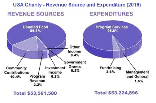
#1 Describe the image given below within 40 seconds-
Model Answer-
The pie chart shows the source of revenue and expenditure made by USA Charity during the year 2016.
The major source of revenue for charity is from the donation of food that is to be over 86.6% of total $53,561,580. While 95.8% of total $53,224,896 is spent on program services as compare to other programs. Fundraising and Management & General programs contribute 2.6% and 1.6% of total expenditure. On the other hand, the rest of source of revenue for charity is from community contributors, program revenues, Government grants and investment income.
To conclude, the total amount of revenue exceeds the total amount of expenditure made by USA Charity in the year 2016.
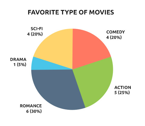
#2 Describe the image given below within 40 seconds-
Model Answer-
The pie chart exhibits the preference of 20 people in watching 5 different genres of movies.
It is clearly stated that around 30% of people that is 6 out of 20 prefers to watch romantic movies rather than any other. Where 25% of people still love to watch action movies which are marked to be second highest among others. Comedy and sci-fi have the equal number of preference which is around 20% of 20 people. But the least preferred genre movie is drama which rarely watched by 5%.
It can be concluded that romantic movies have swept first in the race against all genres of movie where drama has lost in pace in between.
RELATED LINKS-